The MSE loss is attractive because the expected error in estimation can be explained by the bias and the variance of the model. This is called the bias-variance decomposition. In this article, we will introduce this decomposition using the tools of probability theory.
In short, the bias-variance decomposition is:
In machine-learning, the error in estimation is not the same as the error in prediction. The error in prediction can be explained in terms of the bias-variance-noise decomposition.
Notations
Let be a pair of random variables on .
Assume there exists a function such that:
The goal of a regression is to use a sample to estimate this function:
For instance, in a linear regression the function is a linear function with parameter :
And the regression aims at estimating from the training-set:
The expected output
The output of the regression depends on the sample that was used during training. In expectation, the estimated function is:
Bias
The bias measures how wrong the model is on average. It is the difference between this expected function and the true function:
Variance
The variance measures how instable the model is. The more the estimated function depends on the specific details of the training-set , the higher the variance. It is equal to:
The bias-variance decomposition
What error in estimation can we expect when variates?
The bias-variance decomposition is:
It is important to distinguish error in estimation (between and ) and error in prediction (between and ). Let’s tackle the error in prediction now.
The bias-variance-noise decomposition
A frequent use case for regression is when is a signal of distorted by some random -mean noise :
In such cases, the error in prediction between and can be expressed using the bias-variance-noise decomposition:
See our dedicated article for more info.
Illustration
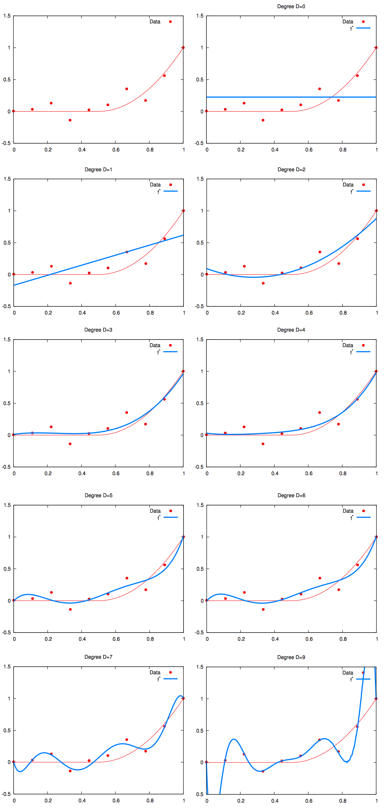
This can be illustrated using polynomial regressions. A polynomial regression of degree is a line regression, which have high bias but very low variance. As the polynomial degree increases, the bias reduces but the variance increases.
On the plot below:
- the red curve is the deterministic relationship ;
- the red dots are observations polluted by the noise (which explains why they are not on the line);
- the blue curve is the regression line of one model .
To vizualize the bias and variance tradeoff, we need to train several models. Let’s generate several trainset using the source. Recall that the relationship to be learned is the same accross datasets, but the noise observations are random.
On the plot below:
- the red curve is the deterministic relationship ;
- we didn’t plot the red dots to avoid cluter;
- the blue curves are the regression lines for each of the trained model generated thus.
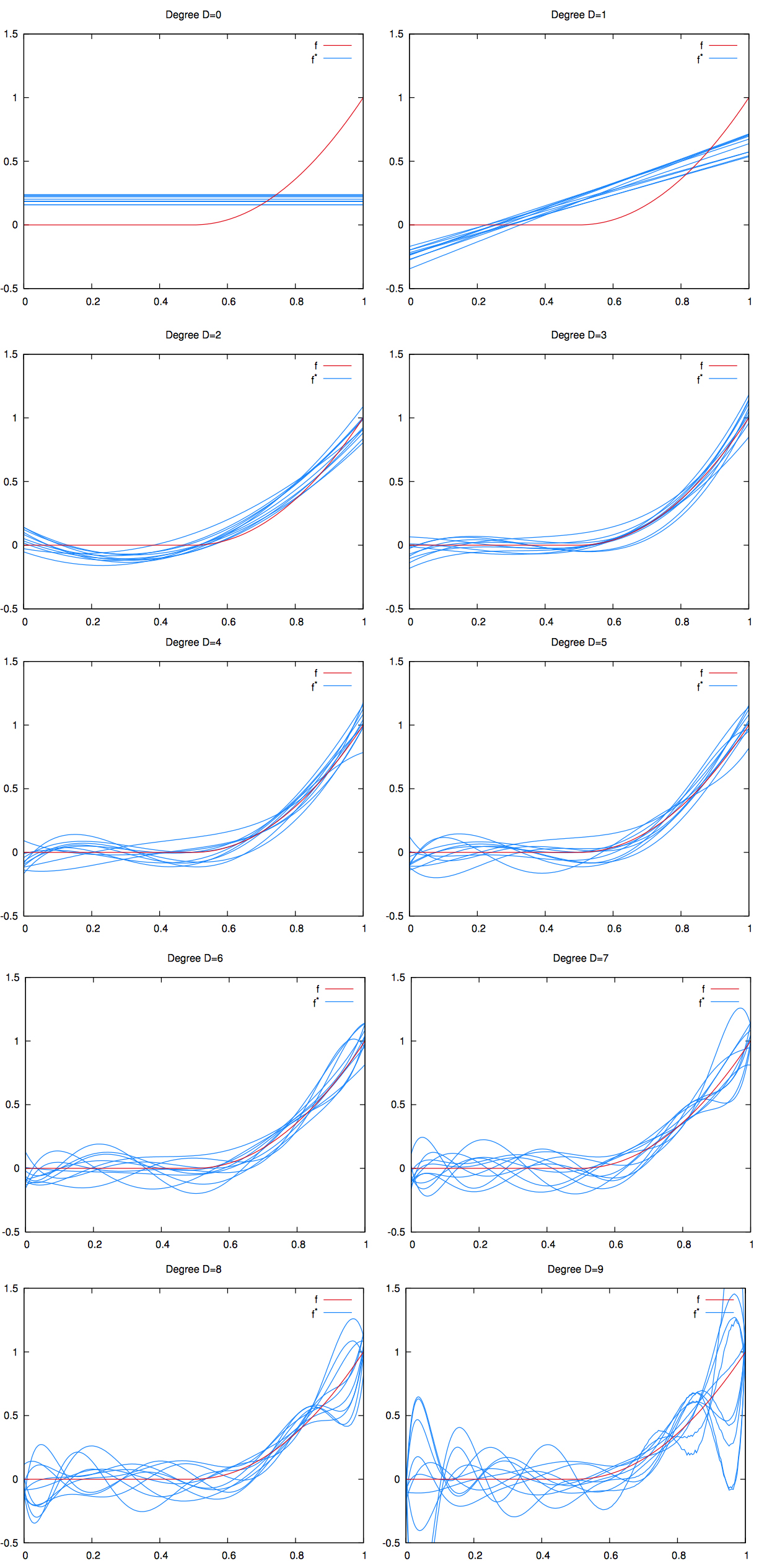
We can see that as the degree increases the blue curves are more and more appart from each other. This is a manifestation of the high variance.
Taking the average of the blue lines, we can visualize the bias. On the picture below, we graphed the mean of the regression curves in blue. The gray shape around it is the spread of all the regression curves.
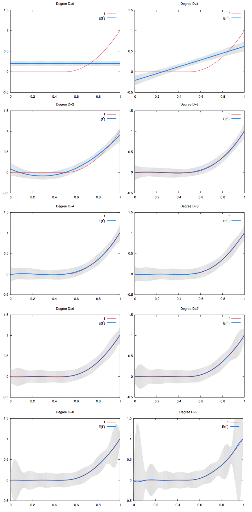
- We can see that for low degree polynomials, the blue curve does not fit the red curve: they have high bias. But the gray shape has small width: they have low variance.
- On the other hand, for high degree polynomials, the blue curve perfectly match the red curve: they have low bias. But the gray shape has large width: they have high variance.